Logo Design for joi
A logo that had a good idea behind it, a logo that could exemplify our abilities to ideate. Which transcends everything we do as an studio.
From the get go, we knew we wanted a logo that resembled a smile. A logo that had as much joy in it as possible. Joy was a bit too used throughout the internet, so decided to go with a more unique spelling joi.
These were the first variations of the logo.
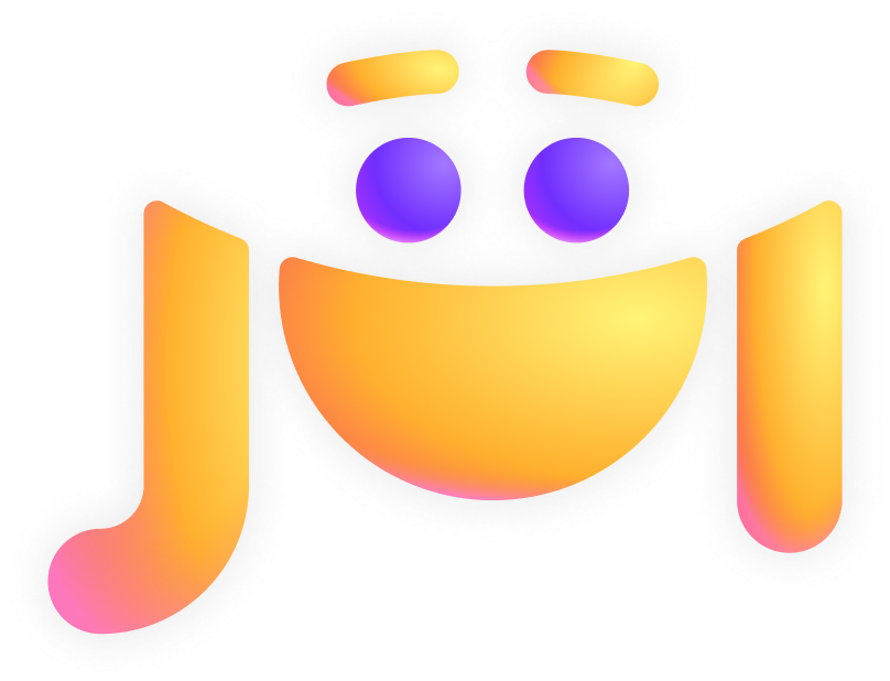
After conceptualising how a smiley face could be made from the o, after slicing through it, we quickly realised that the dots from both the i’s could be used as eyes in the smiley face.


We knew this was exactly what we wanted in a logo.
Few variations and fine tunes later we ended up with this.

And then the final dynamic joi logo.

We decided to animate our logo, because we thought it was cute, why not right? 🙂
Our first animation idea attempt


Followed by our second


Variation 1

Variation 2

Variation 3

And a few more variations later, ultimately, to get here:
An animation that perfectly reflects the brand, and everything we stand for.
We help do good companies, do better:
and in turn, bring more joy and lightness to this world.


